Best Home Pages for Your Browser


My experiment, explained, tested, and updated for 2026
Are you sick of using the default browser homepage or start page? Or perhaps you're just sick of being held within the stranglehold of big tech? Maybe you just want something new.
As a heavy computer user, developer, and overall nerd who enjoys poking around the Internet like most, I did a bit of testing in Chrome and Firefox, to see if there is a better homepage alternative to yahoo, MSN, or Google's new tab page.
I had been using Google's new tab page, but it's honestly kind of bleh, meh. And I used Yahoo for a while, but got sick of all the ads. So, I did some research, 3-months worth of testing, and there's a clear winner that came out of the experiment. One which has me switching permanently.
Each person may have a different opinion as to what makes for a great home page. But, ultimately, a recommended home page should feel personal. And, let's not forget things like its speed, reliability, simplicity, usefulness, and (in my opinion) a bit of fun.
Further, I think it needs to have some customizable elements, which make it feel like its your own.
In an attempt to see what the user experience is like on various homepages around the Internet, I spent some time using the sites listed on Top 10 homepages list. My goal was to see which, if any, sites excel and are worth me switching permanently.
Advertising will not be used in the calculation of a final score, but will be covered in my reviews.
How well is the content laid out? Is it too condensed and busy? How can I access a lot of websites without the clutter?
Are there settings that make the site more customizable? Can I change the looks of the site?
Are the links easy to see, find and click? Is it cluttered or is it easy to navigate and jump to other websites?
Is the page aesthetically pleasing?
How quickly does the page load initially? I will be using Pagespeed Insights to determine the speed of each website.
Does the homepage have ads? If so, are they distracting?
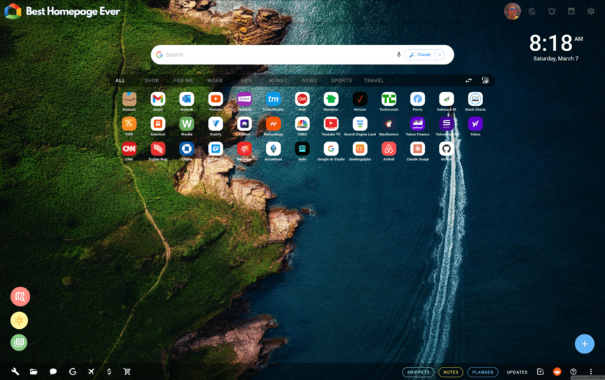
The first site is Best Homepage Ever. I have now spent 30 days on the site.
The menus in the footer provide quick links to a variety of useful sites and tools. In order: Internet tools, office documents, Google sites, and a native money page that is well thought out and up-to-date with live real-time financial information. Additionally, there is a travel section, shopping "Gift Finder" which is pretty amazing, and an all-new background creator so you can create your own artificial intelligence backgrounds.
The main section of the site contains websites that you add yourself through an Add Websites menu from a blue + button. The sites can be categorized for you through a toolbar but I didn't use this in my experiment.
Best Homepage Ever has a clever assortment of tools, functions, and customizability that I came away really impressed with. The addition of things like an image compressor, background creator, link shortener, "My Places" searching, and so much more.
Everything I used worked well, including the site's 3 different browser extensions called Portal, Pindrop, and Tab Page, which all add enhanced features like adding recipes, websites, articles, and videos, to your homepage.
The site has many functions that are accessed within the settings panel of the site. For instance, you can auto-switch your background, change your search options, clock appearance, size of your website icons, etc.
The site is pretty straightforward and simple to use. The main links section, named the Launchbar is front and center, which allows you to quickly jump to any website on the Internet. You can add any amount of websites to this area.
Of all the homepages reviewed in this study, this site looks the best.
The menus are subtle and "glossy" looking. You can add/remove/edit any of the elements, with different colors. If you don't like the default background image, there are an additional 800 images (I think) to choose from within the settings panel.
If you do not want to see the notes or disclosures, or any other icons in the footer, you can hide them, which is a nice touch.
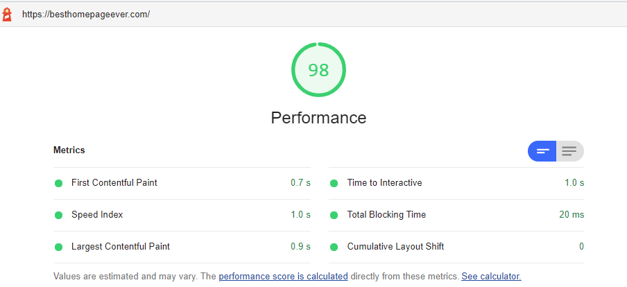
PageSpeed Insights pegs the load speed at
1.7 seconds 1.0 seconds, which is a fantastic speed. The site underwent some changes
to both the server and CSS properties to improve this over the
last month.
When clicking around, hovering over menus, and navigating to other parts of the website, the site is good. No buffering, slowdowns, or delays.
UPDATE: As of January 6, 2026, the performance has greatly increased as seen below.

Screenshot of Best Homepage Ever's main page.
Summary: Best Homepage Ever is the easily the best of breed amongst these homepages for a number of reasons. It excels in all 5 elements in my experiment's criteria.
The ability to edit basically anything to your liking, create your own backgrounds, access countless tools that are useful and ad-free, makes it a pleasure to use.
The layout is intuitive, the site speed is outstanding, and the site is constantly updating with new bells and whistles that will keep you coming back for more.
Overall Rating: 4.9 out of 5.0
(average score)
Are there advertisements? NO
There are no ads on Best Homepage Ever.
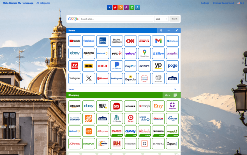
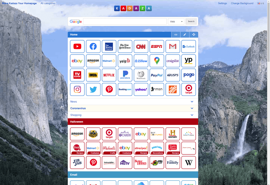
The second homepage site I tried out was Kadaza. I spent 11 days using the site, and overall I was pleased. They cater to a global audience, and have a huge directory of sites to choose from.
Well organized, but also a bit overwhelming. The checkerboard style site layout allows you to see a plethora of sites, with each one highlighted by their logo. When looking through all their categories and sub-categories, the amount of sites was endless so I was impressed by the ability to add links from an almost infinite number of sites.
As far as the organization of the site categories, I found them to be useful and easy to navigate. However, once again, the sheer number of dropdown menus to choose from prevents this from receiving a full 5-stars.
With just 2 settings, I found the functionality to be the weakest aspect of the website. You can choose which search engine to use (Google, Yahoo, or Bing) and which background to display. I would have liked to have seen a few more options available.
Settings menu for Kadaza
With well over 100 categories to choose from, I found the site selection to be a bit overwhelming and require multiple clicks in order to visit a website.
Quantity is not necessarily better than quality. And I found this to be more of a site directory than an easy to use homepage.
The logo reminds me of one of Google's old logos in the early days. It consists of colorful block lettering, but overall was pretty basic in appearance.
According to PageSpeed Insights, Kadaza loads in 1.8 seconds, which is moderate to good. In my experience, I thought the site loaded quickly enough to where speed was not really an issue.
Screenshot of Kadaza's main page.
Summary: I liked the background selection, and the accordion style categories, which allow you to access LOTS of different websites. However, from a standpoint of organization and simplicity, the site was overwhelming. I found having to navigate through thousands of sites in categories and sub-categories became tiresome and felt like a directory of sorts. But overall, some visitors will enjoy the broad selection and discover sites for future use.
Overall Rating: 3.4 out of 5.0
(average score)
Are there advertisements? NO
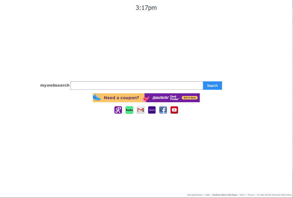
Screenshot of MyWebSearch's main page.
Summary: My Web Search may be a site that some people actually prefer, even though the summary score is low. Despite the excellent speed, I personally found the site to be a bit soft on too many of the characteristics I believe matter most when choosing a homepage. I don't enjoy ads, and I think that ultimately it was my least favorite of the group due to the lack of sites to engage with.
Overall Rating: 2.6 out of 5.0
(average score)
Are there advertisements? YES
There is one advertisement, but it is front-and-center. Was it invasive? No. But was it distracting at times? Yes.
The next site is My Web Search. I spent 8 days using this site, and came across many aspects that I liked, but also disliked about this site.
The organization, in a sense, couldn't be any cleaner. The few sites that are listed are laid out nicely right below a search bar. However, there are only 6 sites to choose from, and an advertisement is also listed front and center.
The main function of the site is the search bar. However, the site is set up using Google's custom search feature. There are no other real settings or customization features to speak of.
This is where the review of this site is challenging, as the simplicity is apparent. But, one could argue it's a bit too simplistic. There are only 6 sites to use, so I felt the simplicity is actually a negative here.
The aesthetics really are okay. However, due to the advertisement being front-and-center, I felt like this was a slight distraction. There are no options for the addition of a picture or background other than the basic white color.
This is where the site excels. The site loads at a blazing 0.7 seconds (mostly due to its very small page size). I kind of expected this site to be fast, and it was while using it.
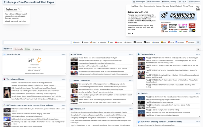
The next site is ProtoPage, which I spent 10 days using as my homepage. This site has a lot to offer, and the site is fairly in-depth.
The site is a bit chaotic, but certain aspects are well thought out. Overall, I think the best way to describe the site is organized chaos. Boxes are filled with news sources, weather features, and more.
The widgets come with several options. For instance, the weather widget allows for various length forecasts. News stories appear with strikethrough after being read. I've given 5-stars because the owner(s) made a clear attempt at making the site functional.
This site is not simple. They have tried to fit a lot in here, and they've succeeded in doing so. However, it is at the expense of simplicity.
This site has its aesthetic pros and cons. There are backgrounds to choose from, but they are low resolution images. Some aspects appear a bit dated.
The page speed here is solid. The website loads in 1.2 seconds, giving it a solid score. Extremely high marks were given here.
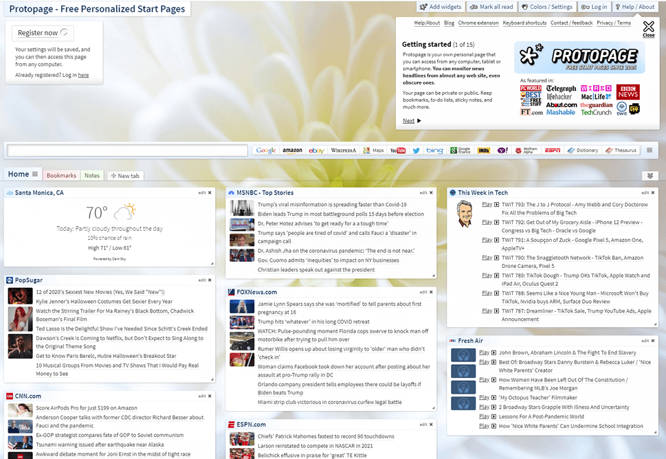
Screenshot of Protopage home page.
Summary: After using Protopage for 10-days, I think that somebody who weighs news as being their top priority for their homepage, would like it. The site is structured pretty well, but it is a bit busy for my liking. It is fast to load, and also a plus is it shows your local weather.
Overall Rating: 4.0 out of 5.0
(average score)
Are there advertisements? NO
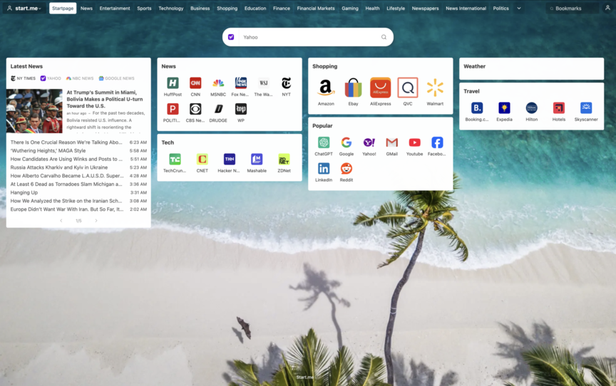
The next site is Start Me. I spent 10 days using this site. I was thoroughly impressed with certain aspects of this site. Let's dive now to see where certain aspects of the site are best.
There is a lot to go over here with the organization of Startme. They have done a fantastic job at packing in a lot of content into a small space. The main news widget offers Google news, CNN, Fox News, and the New York Times. Other news must be accessed through the news section, which unfortunately loads kind of slow, and can be a bit excessive due to the sheer amount of content.
However, sources can and should be customized, so organization can technically be improved over time. Because of this, and the fact that they have succeeded in displaying a lot of content in small spaces, I feel like the site is worthy of 4/5 stars.
This site functions quite well. The page is awesome if your main purpose is to view news on your homepage. Some categories of sites are more customizable than others. But in some cases, you are forced to navigate through the icons of sites that are already pre-chosen, rather than selecting your own. This is okay, unless you have to look at sites you'll never use.
On the opposite side of the spectrum, there are certain functions that seem completely unnecessary. For example, I don't see why anyone would need to open up 9 sports webpages at once, which is what will happen if you select the sports box and choose to "open in new tabs."
StartMe has certain aspects of the site which are nice and simplistic. I really like the tabs within the widgets, as this allows you to see a lot of information in a small space. The upper tabs, which allow you to switch between entertainment, finance, gaming, etc, are pretty helpful, but they have their drawbacks (see Speed section below). I don't think this is a site one would use if you prefer a simple layout. It's a bit too much for those purposes. However, there are also parts of the page that are a bit unnecessary.
Startme functions well, is organized well, but less effort was made in making the page look good. There are backgrounds to choose from, which in theory is a huge plus, but they fall short because they are covered up by all the widgets in the foreground.
The site speaks more to the news reader than those who wish to open up their browser with a pretty looking site. The layout is rather complex, and really nothing is exceptional in the site's aesthetics.
The site is pretty quick overall. However, switching tabs between the various sections of the site is where things slow way down. I ended up not using those tabs much at all, except for on the first day where I was exploring the site thoroughly. Bottom line: The site loads in 2.3 seconds on average, which is pretty decent, but nothing special.
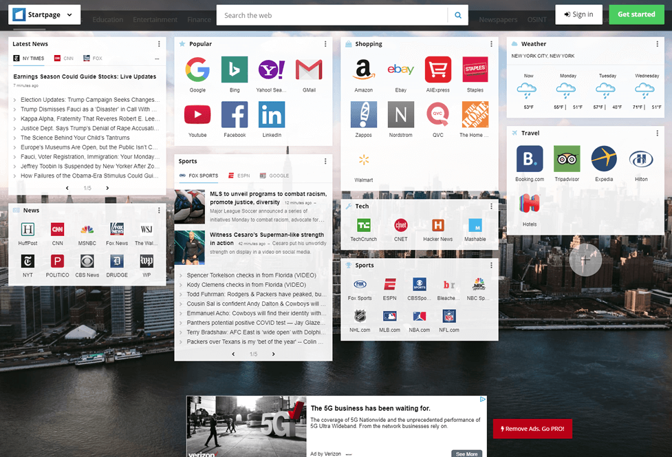
Screenshot of Startme's main page.
Summary: The news widgets are the highlight here, with the ability for you to switch between pages within each news source. That's a sweet function that I enjoyed. There are going to be many people out there that enjoy the amount of news being displayed. When drawing comparisons, I felt like the site does an excellent job in those components, but I wish they offered a bit more fun, design, and an improved user interface.
Overall Rating: 3.4 out of 5.0
(average score)
Are there advertisements? YES
There is one advertisement at the bottom of the page. Was it invasive? No, because you have to scroll down to see it. Was it distracting? Sometimes.
| Criteria | Best Homepage Ever | Kadaza | MyWebSearch | Protopage | StartMe |
|---|---|---|---|---|---|
| Did the site exceed your expectations? | |||||
| Does the site do a good job balancing organization and functionality? | |||||
| Was the site easy to begin using as your homepage? | |||||
| Would you consider setting it as your homepage? | |||||
| Final Score | 4.9 | 3.4 | 2.6 | 4.0 | 3.4 |
When comparing these sites, there are really no losers. Each has their own style, layout, and strategies as to what makes an efficient and useful home page for daily usage. All the opinions above are listed as my own. I encourage you to visit all of these sites and choose the one which suits your interests the most.